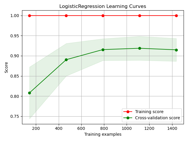
plot_learning_curve with examples#
An example showing the plot_learning_curve method used by a scikit-learn classifier
# Authors: scikit-plots developers
# License: MIT

from sklearn.datasets import (
    make_classification,
    load_breast_cancer as data_2_classes,
    load_iris as data_3_classes,
    load_digits as data_10_classes,
)
from sklearn.model_selection import train_test_split
from sklearn.linear_model import LogisticRegression
from sklearn.naive_bayes import GaussianNB
from sklearn.svm import LinearSVC
from sklearn.ensemble import RandomForestClassifier
from sklearn.model_selection import cross_val_predict
import numpy as np; np.random.seed(0)
# importing pylab or pyplot
import matplotlib.pyplot as plt

# Import scikit-plot
import scikitplot as skplt

# Load the data
X, y = data_10_classes(return_X_y=True, as_frame=False)

# Create an instance of the LogisticRegression
model = LogisticRegression(max_iter=int(1e5), random_state=0)

# Plot!
ax = skplt.estimators.plot_learning_curve(
    model, X, y
);

# Adjust layout to make sure everything fits
plt.tight_layout()
# Save the plot to a file
# plt.savefig('plot_learning_curve_script.png')
# Display the plot
plt.show(block=True)
Total running time of the script: (0 minutes 4.675 seconds)
Related examples