plot_aucplot_script with examples#
An example showing the aucplot function
with a scikit-learn classifier (e.g., LogisticRegression) instance.
# Authors: The scikit-plots developers
# SPDX-License-Identifier: BSD-3-Clause
Import scikit-plot
import scikitplot.snsx as sp
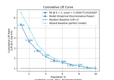
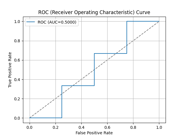
ax = sp.aucplot(
    x=[0, 1, 1, 0, 1, 1, 0, 1, 1, 0],
    y=[0.1, 0.2, 0.3, 0.4, 0.5, 0.6, 0.7, 0.8, 0.9, 1.0],
    fmt=''
)
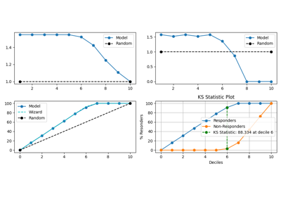
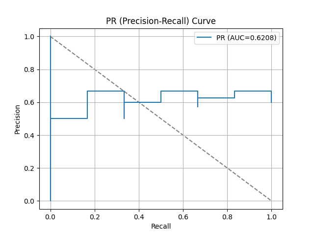
ax = sp.aucplot(
    x=[0, 1, 1, 0, 1, 1, 0, 1, 1, 0],
    y=[0.1, 0.2, 0.3, 0.4, 0.5, 0.6, 0.7, 0.8, 0.9, 1.0],
    kind="pr",
    fmt=''
)
import matplotlib.pyplot as plt
import numpy as np; np.random.seed(0) # reproducibility
import pandas as pd
from sklearn.datasets import make_classification
from sklearn.datasets import (
load_breast_cancer as data_2_classes,
load_iris as data_3_classes,
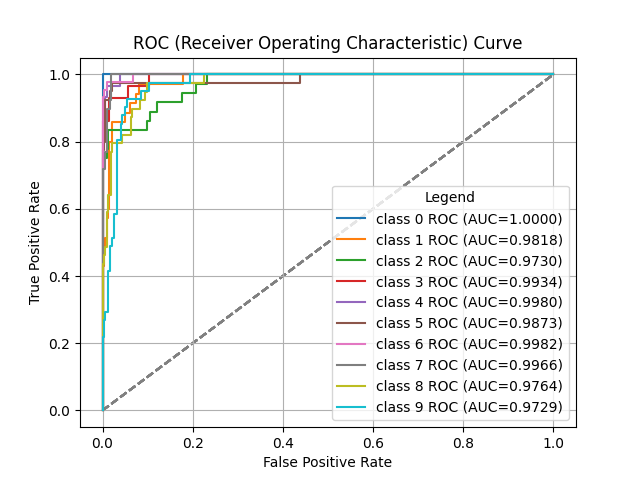
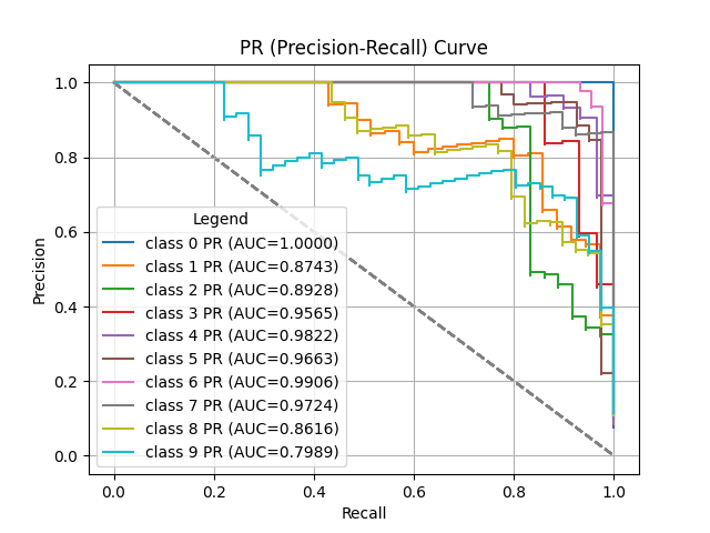
load_digits as data_10_classes,
)
from sklearn.linear_model import LogisticRegression
from sklearn.model_selection import train_test_split
Load the data X, y = data_3_classes(return_X_y=True, as_frame=False) X, y = data_2_classes(return_X_y=True, as_frame=False)
# Generate a sample dataset
X, y = make_classification(n_samples=5000, n_features=20, n_informative=15,
                          n_redundant=2, n_classes=2, n_repeated=0,
                          class_sep=1.5, flip_y=0.01, weights=[0.85, 0.15],
                          random_state=0)
X_train, X_val, y_train, y_val = train_test_split(
    X, y, stratify=y, test_size=0.2, random_state=0
)
np.unique(y)
array([0, 1])
Create an instance of the LogisticRegression
model = (
LogisticRegression(
# max_iter=int(1e5),
# C=10,
# penalty='l1',
# solver='liblinear',
class_weight='balanced',
random_state=0
)
.fit(X_train, y_train)
)
# Perform predictions
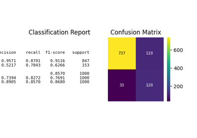
y_val_prob = model.predict_proba(X_val)
# Create a DataFrame with predictions
df = pd.DataFrame({
"y_true": y_val==1, # target class (0,1,2)
"y_score": y_val_prob[:, 1], # target class (0,1,2)
# np.argmax
"y_pred": y_val_prob[:, 1] > 0.5, # target class (0,1,2)
# "y_true": np.random.normal(0.5, 0.1, 100).round(),
# "y_score": np.random.normal(0.5, 0.15, 100),
# "hue": np.random.normal(0.5, 0.4, 100).round(),
})
df
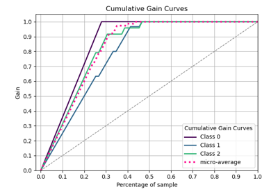
ax = sp.aucplot(x=df.y_true, y=df.y_score)
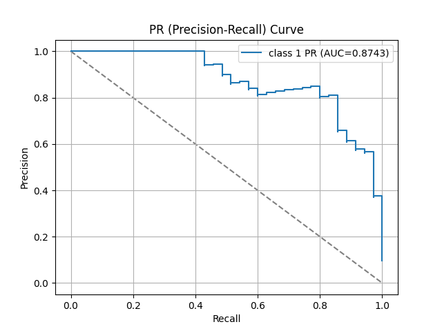
ax = sp.aucplot(
    df,
    x="y_true",
    y="y_score",
    kind="pr",
    label=f"class 1",
    # fmt=''
)
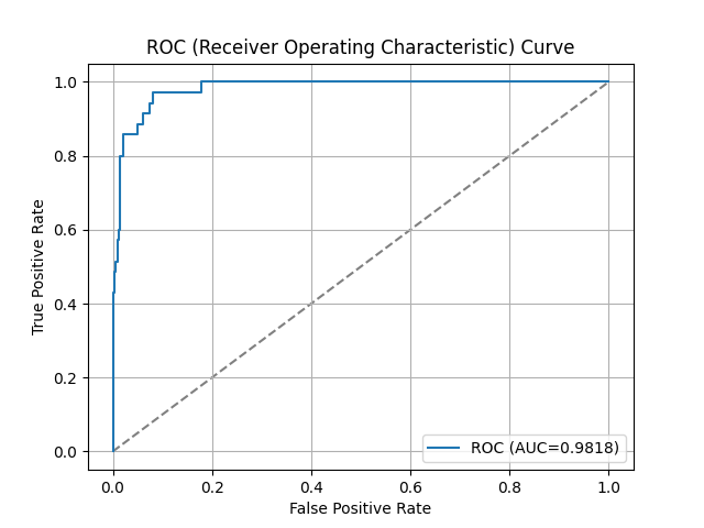
for i in range(2):
    ax = sp.aucplot(
        x=y_val==i,
        y=y_val_prob[:, i],
        # kind="roc",
        label=f"class {i}",
        # fmt=''
    )

    # --- Collect unique handles and labels ---
    handles, labels = ax.get_legend_handles_labels()
    by_label = dict(zip(labels, handles))  # deduplicate

    # Override legend
    ax.legend(by_label.values(), by_label.keys(), title="Val Dataset")
for i in range(2):
    ax = sp.aucplot(
        x=y_val==i,
        y=y_val_prob[:, i],
        kind="pr",
        label=f"class {i}",
        # fmt=''
    )

    # # With raw arrays (no DataFrame)
    # # Works because seaborn normalizes arrays internally
    # np.random.seed(i)  # reproducibility
    # ax = sp.aucplot(
    #     x=np.random.normal(0.5, 0.1, 100).round(),
    #     y=np.random.normal(0.5, 0.1, 100),
    #     kind="pr",
    #     label=f"{i}",
    # )

    # --- Collect unique handles and labels ---
    handles, labels = ax.get_legend_handles_labels()
    by_label = dict(zip(labels, handles))  # deduplicate

    # Override legend
    ax.legend(by_label.values(), by_label.keys(), title="Val Dataset")
Total running time of the script: (0 minutes 0.572 seconds)
Related examples