evalplot#
- scikitplot.snsx.evalplot(data=None, *, x=None, y=None, hue=None, kind=None, weights=None, labels=None, threshold=0.5, allow_probs=False, hue_order=None, hue_norm=None, palette=None, color=None, fill=False, baseline=False, line_kws=None, log_scale=None, legend=False, ax=None, cbar_kws=None, cbar=True, cbar_ax=None, text_kws=None, image_kws=None, annot_kws=None, annot=True, fmt='', digits=4, common_norm=None, verbose=False, **kwargs)[source]#
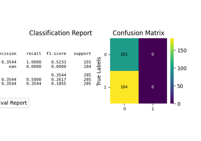
Visualization of the Confusion Matrix [1] alongside a text report showing key classification metrics.
For guidance on interpreting these plots, refer to the Model Evaluation Guide.
- Parameters:
- data
pandas.DataFrame,numpy.ndarray, mapping, or sequence Input data structure. Either a long-form collection of vectors that can be assigned to named variables or a wide-form dataset that will be internally reshaped.
- x, yvectors or keys in
data Variables that specify positions on the x and y axes.
- huevector or key in
data Semantic variable that is mapped to determine the color of plot elements.
- kind{‘all’, ‘classification_report’, ‘confusion_matrix’} or None, default=None
Which visualization to draw.
'classification_report': text report fromsklearn.metrics.classification_report.'confusion_matrix': heatmap fromsklearn.metrics.confusion_matrix.'all': a 1x2 dashboard (classification report + confusion matrix).
- weightsvector or key in
data Sample weights passed to the underlying scikit-learn metric functions.
- labelsarray-like, optional
Class label ordering. When provided, it is forwarded to
sklearn.metrics.confusion_matrixandsklearn.metrics.classification_report.- thresholdfloat, default=0.5
Threshold used to convert probabilities into predicted class labels when
allow_probs=True.- allow_probsbool, default=False
If True, interpret
yas probabilities in[0, 1]and derive predicted labels viay > threshold. This requires binary classification. Behavior like ‘y > thr’ seenumpy.argmax.- hue_ordervector of strings
Specify the order of processing and plotting for categorical levels of the
huesemantic.- hue_normtuple or
matplotlib.colors.Normalize Either a pair of values that set the normalization range in data units or an object that will map from data units into a [0, 1] interval. Usage implies numeric mapping.
- palettestring, list, dict, or
matplotlib.colors.Colormap Method for choosing the colors to use when mapping the
huesemantic. String values are passed tocolor_palette. List or dict values imply categorical mapping, while a colormap object implies numeric mapping.- color
matplotlib color Single color specification for when hue mapping is not used. Otherwise, the plot will try to hook into the matplotlib property cycle.
- fillbool or None
If True, fill in the area under univariate density curves or between bivariate contours. If None, the default depends on
multiple.- {line}_kwsdictionaries
Additional keyword arguments to pass to
plt.plot.- log_scalebool or number, or pair of bools or numbers
Set axis scale(s) to log. A single value sets the data axis for any numeric axes in the plot. A pair of values sets each axis independently. Numeric values are interpreted as the desired base (default 10). When
NoneorFalse, seaborn defers to the existing Axes scale.- legendbool
If False, suppress the legend for semantic variables.
- ax
matplotlib.axes.Axes Pre-existing axes for the plot. Otherwise, call
matplotlib.pyplot.gcainternally.- cbar_kwsdict
Additional parameters passed to
matplotlib.figure.Figure.colorbar.- cbarbool
If True, add a colorbar to annotate the color mapping in a bivariate plot. Note: Does not currently support plots with a
huevariable well.- cbar_ax
matplotlib.axes.Axes Pre-existing axes for the colorbar.
- text_kwsdict, optional
Keyword arguments passed to
matplotlib.axes.Axes.textwhen rendering the classification report (and for confusion-matrix annotations).- image_kwsdict, optional
Keyword arguments passed to
matplotlib.axes.Axes.imshowwhen drawing the confusion matrix. Recognized keys:- cmapNone, str or matplotlib.colors.Colormap, optional, default=None
Colormap used for plotting. Options include ‘viridis’, ‘PiYG’, ‘plasma’, ‘inferno’, ‘nipy_spectral’, etc. See Matplotlib Colormap documentation for available choices.
https://matplotlib.org/stable/users/explain/colors/index.html
plt.colormaps()
plt.get_cmap() # None == ‘viridis’
- annot_kwsdict of key, value mappings, optional
Keyword arguments for
matplotlib.axes.Axes.textwhenannotis True.- annotbool or rectangular dataset, optional
If True, write the data value in each cell. If an array-like with the same shape as
data, then use this to annotate the heatmap instead of the data. Note that DataFrames will match on position, not index.- fmtstr, optional, default=’’
Formatting spec for confusion matrix annotations (e.g.,
'.2f'). Whennormalizeis not None andfmtis empty, it defaults to'.2f'.- digitsint, optional, default=4
Number of digits for formatting output floating point values. When
output_dictisTrue, this will be ignored and the returned values will not be rounded.- normalize{‘true’, ‘pred’, ‘all’, None}, optional, default=None
Normalization mode passed to
sklearn.metrics.confusion_matrixwhenkindincludes'confusion_matrix'.‘true’: Normalizes by true (actual) values.
‘pred’: Normalizes by predicted values.
‘all’: Normalizes by total values.
None: No normalization.
- common_normbool
If True, scale each conditional density by the number of observations such that the total area under all densities sums to 1. Otherwise, normalize each density independently.
- zero_division{“warn”, 0.0, 1.0, np.nan}, default=”warn”
Sets the value to return when there is a zero division. If set to “warn”, this acts as 0, but warnings are also raised.
- output_dictbool, default=False
If True, return output as dict.
- verbosebool, optional, default=False
Whether to be verbose.
- kwargs
Other keyword arguments are passed to one of the following matplotlib functions:
- data
- Returns:
matplotlib.axes.AxesThe matplotlib axes containing the plot.
Warning
Some function parameters are experimental prototypes. These may be modified, renamed, or removed in future library versions. Use with caution and check documentation for the latest updates.
- Parameters:
- Return type:
Notes
When
kind='all', a 1x2 dashboard is created. If the providedaxis not the only axes in its figure, a new figure is created.If multiple semantic subsets are present (e.g., multiple
huelevels), confusion-matrix-style plots do not overlay cleanly; only the first subset is plotted and a warning is emitted.
References